 |
 |
 |
 |
| Final lecture at the University of Tokyo. |
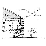 |
| Sensation of inside and outside reversal experienced in the Italian piazza. |
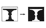 |
| Figure-ground reversal in Edgar Rubins vase-faces figure. |
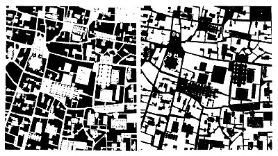 |
| Positive and negative prints of Giambattista Nollis map of Rome, 1748. |
 |
| Positive and negative prints of an old map of Edo (Tokyo): Source: Kohan Edo-zu shûsei [A Collection of Old Edo Maps], vol. 7. |
 |
| Degrees of enclosure. |
 |
| When object A and the reverse space balance each other beautifully, monumentality is enhanced. |
 |
| Complex monumentality: (N+PN) space. |
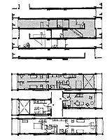 |
| Floor plan of units in Unité d'Habitation, Marseilles. |
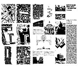 |
| Tom Shumachers essay on contextualism. |
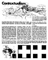 |
| Grahame Shanes article, Contextualism. |
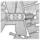 |
| Fig. 1 Piazza Ducale, Vigevano, Italy. |
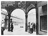 |
| Piazza Ducale, Vigevano, Italy. |
|
 |
 |
Ashihara Yoshinobu
Final Lecture: Department of Architecture, University of Tokyo
February 2, 1979
(translation by Lynne E. Riggs)
Part 2
Principles of Composition in Exterior Design
Next I would like to speak about the composition of the townscape, which has long been a source of great fascination to me. The street, Bernard Rudofsky wrote,
|
| |
. . . cannot exist in a vacuum; it is inseparable from its environment. In other words, it is no better than the company of houses it keeps. The street is the matrix: urban chamber, fertile soil, and breeding ground. . . .The perfect street is harmonious space. Whether it is confined by the near-hermetic houses of an African Kasbah or by Venetian filigree marble palaces, what counts is the continuity and rhythm of its enclosure. One might say that the street is a street by courtesy of the buildings that line it. Skyscrapers and empty lots do not a city make.*4
|
|
We hear more and more supporters of this view in recent years, but in the early twentieth century, when the ideas of Modern Architecture were being advanced and Le Corbusier made his slogan soleil, éspace, verdure (sun, space, and greenery) and advocated putting buildings as far apart as possible. Those principles held sway for a long time, but ideas on the townscape have grown increasingly diverse of late and there is now much greater appreciation of the importance of continuity and rhythm in space that Rudofsky so aptly expressed.
This idea always takes me back to a memorable experience of my own some twenty years ago when I first visited Italy. Pausing in one of the piazzas of a city there, I distinctly remember the strong impression of that space. There was not one tree in the square. The pavement was beautifully doneI think there was a mosaic pattern in ittidy and clean. The pavement went right up to the walls of the surrounding buildings, and in Italy the buildings are masonry, either brick or stone masonry. And as you are aware, the interior and the exterior of a masonry house is similar in quality, whether it be stone or brick. The flooring, moreover, is continuous, from outside to inside, so you just keep walking along without taking your shoes off. Standing in that Italian piazza, I had to think for a moment what marked the difference between inside and outside in Italian space. Well, it is quite simple: what has ceilings or roofs is interior and what does not is exterior. The space of both is otherwise quite homogeneous.
Perhaps I had had a bit too much of that good Italian wine, but it occurred to me that the roof over what was inside could simply shift over, converting what was just now outside into inside and what one thought was inside would be outside, because the inside and outside spaces were interchangeable. This curious idea of the reversibility of space that struck me twenty years ago was that illustrated by the phenomenon of figure-ground reversal illustrated by Edgar Rubins vase-faces figure. If one is gazing at the figures as two profiles facing each other, the space between them is the ground, but if one focuses on the vase shape, the faces (space) on either side become the ground. The exterior space of Italian streets and squares, in other words, is homogenous with the interior of adjacent architectural space and therefore possesses the qualities of figure. My experience confirmed the existence of Gestalt qualities in Italian exterior space. In Japan, by contrast, I think it would be very difficult to find examples of such interior and exterior space homogeneous enough to be interchangeable.
It is difficult to imagine such reversibility of space, too, in the case of the typical layouts of Modern Architecturewith their emphasis on sun, space, and greenery. I studied this idea by looking at various maps and found that those of Italian cities well illustrate this reversibility. The well-known map of Rome by Giambattista Nolli (1748) is a good example. In the positive print, the inside spaces are white and the exterior spaces are black; in the negative print, it is almost the exact reverse, and two maps look largely the same. Positive and negative prints of an old map of Edo (Tokyo), by contrast, do not show this kind of reversibility of figure and ground. As mentioned earlier, this is because inside shown on maps of Japanese cities is delineated not by architecture but by fences around compounds, and the outside space shown is mainly just the narrow streets.
This experience became the inspiration for much of my subsequent work regarding the design of space. One example was the work that came along to design the Chuo Koron building, in which I experimented with Marcel Breuers style of split-level floor design, situating the first-floor level slightly above ground-level. The building was bounded by streets on its front and back sides, and there was just a little space separating it from the neighboring buildings on both ends. At that time, I kept thinking, if only we could have used that space effectively to enrich the townscape and give it a kind of Gestalt quality.
This has to do, of course, with the definitions of P (positive) and N (negative) spacenow perhaps quite an old ideabut a problem that was brought to my attention by what I saw in the townscape in Italy. It made me think about what we can do to create space with a sense of enclosure or openness.
Another issue that I studied was the ratio of distance (D) to building height (H)the D/H ratio. It makes a big difference whether this ratio is 1, 2, 3, or 4, and especially if it gets even smaller, at 0.5, 0.25, or even 0.125. In their very interesting book The American Vitruvius: An Architects Handbook of Civic Art, Werner Hegemann and Elbert Peets*5 wrote that a D/H ratio of 2 is necessary in order to fully appreciate a building and for a group of buildings a ratio of about 3. The D/H ratio in the case of medieval European architecture is 0.5. In the Rennaissance, for example, Leonardo da Vinci apparently considered 1 the ideal. Baroque architecture was said to have been designed with the ratio of 2 in mind. It seems that in those days the height of buildings and the space between them or in relation to the width of the street was part of the aesthetic that determined design considerations. Modern architecture relies somewhat on D/H ratios for quite functional reasons, such as to calculate proportions that ensure sunlight and privacy (which can be secured at 1.5 and above), but taking the D/H ratio into account in the composition of space was not, at least in the early decades of the Modern architecture movement, part of an architects criteria in design. Indeed, what distinguished Modern architecture was, in a sense, its rejection of such calculations.
Another issue in the composition of space is enclosure. The use of inside corners, which are conducive to a sense of enclosure and the emergence of figure in space, were among the features that were spurned by the Modern architecture movement. It seems to me, however, that the time may be coming for us to reconsider the usefulness of D/H ratios in the composition of space. When the D/H is 1, and as it gets smaller, at about 0.6, for example, the relation between the walls becomes closer, creating mutual relationships that become intricately intertwined. As we move away, putting more distance between ourselves and the building, the less aware we are of those close mutual relationships. When the distance between buildings is 4 or more, the sense of a relationship between one building and another almost completely disappears. Le Corbusier, for example, was certainly not concerned about the value of a good D/H ratio when he designed the new capital city at Chandigarh in Indias Punjab. With the Secretariat 700 meters away from the High Court building, the D/H is 10 or maybe even 12. More interested in Modern architectures much-lauded principles of sun, space, and greenery, Le Corbusier was not making any attempt to create Gestalt qualities.
Urban architects like Ernö Goldfinger and Gordon Cullen advocated the uses of closure, depicted in the sketches shown at left. For example, if you erect 4 posts and then have someone stand among them. The person has a certain sense of being enclosed, but it is very weak. If, however, there are four walls, set on four sides as in the drawing, open at the corners, you get something like what we experience in a space with buildings on all four sides, but the sense of enclosure is still not that high. A much stronger sense of enclosure is created when the corners of the space are closed and the streets intersect with the space in the center of the sides, such as in the case of a piazza. At the time I thought quite a bit about why this should be, and found that it is readily explained by the application of Gestalt psychology and the law of the inside or the law of closure.
There is also the question whether we can apply the principles of Gestalt psychology to architectural spaces on a very large scale. It could be good; it could be bad. I once went to the Psychology Department and put my question to a professor there. He looked a bit surprised at first and then allowed as how he thought there should be no problem, as internationally there were people like Christian Norberg-Schultz advocating things of this sort.
Another problem I have considered is that of monumentality. For example, suppose we have a great obelisk standing here, like this. It has a striking monumentality. And it maintains a good balance with the negative space around it and serves well to bring attention to the event or person or whatever that to commemorates. However, if other structures appear in the vicinity, as shown here, the balance with the surrounding space is changed, and the monumentality of the obelisk may be diminished. Another kind of monumentality is created, for example, when you have two walls, creating a space that would created a shadow, like thisthat sort of arrangement would form a kind of complex monumentality.
The principle of monumentality applied to architecture results in buildings like Le Corbusiers Unité d'Habitation in Marseilles. A very large building with deeply incised features, it is 160 meters long, 24 meters wide and 60 meters high. I was quite astounded the first time I saw it by its powerful monumentalityjust like an obelisk. There are quite a few problems with the inside, however. The apartment units are 24 meters long and only 4.19 meters wide, making them five times longer than they are wide. Town houses and terrace houses usually have some sort of inner court or garden that relieves the space, but the fact that the Unité apartments are all these long-narrow units shows the extent to which interior space has been sacrificed for the sake of exterior image. The exterior was certainly most striking, although I heard later that various structures had gone up in the vicinity, distracting from the surrounding space and doubtless detracting from the exterior qualities as well.
Considering the various projects I have undertaken myself from this point of view, there is now a great deal of very thought-provoking literature coming out. A group of very interesting essays appeared around 1963-67 by the students studying under Professor Colin Rowe at Cornell University. One is a masters thesis on the Gestalt relationship of figure and ground by Wayne Copper. Another is Physical Context/Cultural Context: Including It All, by Stuart Cohen, published in Yales Oppositions magazine (No. 2; January 1974, pp. 1-40). Apparently this is the first study to use the term contextualism. Another is Tom Shumachers Contextualism: Urban Ideals + Deformations, a study published in 1971 in the Italian journal Casabella. This offers many interesting insights as well, contrasting very prominent architecture, strong on monumentality, such as mentioned regarding Unité d'Habitation, with the kind of introverted, or enclosed space I mentioned earlier of the Italian piazzas or of the Palazzo Uffizi by Giorgio Vasari in Florence. This is indeed what we saw in the Nolli map mentioned above and also what we can experience in the Piazza San Marco in Venicethe feeling of how the black and white spaces are interchangeable. Thus, the basic ideas about the quality of space I referred to earlier are closely related to Tom Schumachers contextualism. Also of great interest is an article by Grahame Shane, who is essentially talking about the ideas of P- space and N-space that had been forgotten and that were making a comeback. Indeed, contextualism is nothing new and has been around for a long time. Each building was considered in the context of the existing townscape.
One fascinating example of exterior design of space can be found in the Piazza Ducale in the small Italian town of Vigevano northwest of Milan. Figure 1 shows the outline of this small piazza, measuring 48 meters wide and 134 meters long, built in typical Renaissance style. Three sides of the piazza are surrounded with elegant arcades and the pavement displays a beautiful mosaic design. The fourth side is bounded by a striking Baroque cathedral. This building is actually built an angle, but its facade has been deliberately adjusted to squarely and symmetrically face the axis of the piazza. In terms of architectural styles, clearly this cathedral was added at a later time. This photograph gives a good idea of the atmosphere of the piazza looking toward the cathedral through the arcades opposite. This piazza is famous among Italians, and it is certainly a fine example showing how important the exterior space of the piazza is to them. We architects design buildings as if buildings were the most important, but in this case the designs are made giving priority to creating the integrity of the piazza space as a wholethis conforms with the idea of contextualism. Looked at according to my theory, you see, if you simply put a roof over this space, the piazza would become interior space. Or, if you took off the roof, the walls would go back to being the exterior walls of the buildings. The beauty of the pavement patterns makes me even more inclined to think of how the space would look with a roof over itso similar is it to interior space.
This idea, of treating the space between buildings as figure (a kind of interior space), can be observed everywhere in Italy. This may be the reason that Leonardo da Vinci and Michelangelo are often said to have built nothing but facades. And then there is Camillo Sitte. I first learned about Sitte when I went to the United States in 1960 to study, as his name appeared in every reference list I received there, and yet I had a terrible time getting hold of his books. When I finally did, I understood why. Le Corbusier, apparently, had little time for Sittes ideas, considering them meaningless or marginal at best. Modern architects who looked up to Le Corbusier, therefore, really did leave Sitte by the wayside, and he was hardly ever mentioned again. More recently, however, the advocates of contextualism are starting to evoke his name again and some studies have begun to appear, such as the most interesting work of Rob Krier,*6 who analyzes the way this piazza is formed. Perhaps we can look forward to new versions of this kind of shape.
As Yatsuka Hajime, a student of Otani Sachio, has written in detail, the urban space theories of Team Ten, Archigram, and Metabolism placed great emphasis on mobility, transmission of information, and the dynamism of development, and the minds of these architects were basically closed to contextualism and ideas like those proposed by Sitte.
These ideas sought to define the space itself as form or the implication of form. They were rather tolerant of the mingling of various functions within the same town block. Regarding the idea of zoning by function, as Jane Jacobs argued, each community needed to confront the mingling of functions separately and that there was no need to clearly separate such functions. She argued that some mixing was actually healthier for the city. These are some of the ideas that have been coming out lately.
*4. Bernard Rudofsky, Streets for People: A Primer for Americans (New York: Doubleday, 1969), pp. 20-21.
*5. See bibliography of The Aesthetic Townscape, and p. 46; and Exterior Design in Architecture, p. 42.
*6. See Urban Space, by Rob Krier (English translation of Stadtraum in Theorie und Praxis, 1975, by Christine Gzechowski and George Black.) New York: Rizzoli International Publications, 1979.
|
|
 |